Contact

  • angus.j.p.doyle@gmail.com

Wednesday 23 December 2015

Christmas Stationery

I was playing around with some line-drawn festive icons and it evolved into these patterns for seasonal stationery. The best of Christmas indoors and Christmas outdoors together!

Wrapping paper:


Greetings cards:


Gift wrapped:


Many thanks to my sister Hannah for taking the photos and for the hipsterish arrangements. (Props are the stylist's own.)

Merry Christmas, one and all!

Tuesday 10 November 2015

Scotland in Triangles

Just a simple concept map. The essential angles of Scotland's geography/geology (especially the Highland and Great Glen fault lines) really lend themselves to this triangular representation of the country. With apologies to Shetland:


Capercaillie

Some simple geometric illustrations of the Caledonian Forest's most charismatic bird in full display ('lekking').

Standard; Badge:


Alternates:


Thinner:

Friday 6 November 2015

Badges / Birches

The Silver Birch might just be my favourite tree. I love the thin elegant shape of its trunk and the horizontal zebra-stripe pattern of the bark. And because I want the whole world to know just how much I love the Birch I set about creating these simple designs for a set of round pin badges.

Autumn sunset; Winter sunset:


Autumn (alternate); Winter night:


PS Big shout out to the Beech and the Scots Pine. It was a close-run thing...

Tuesday 3 November 2015

Clydebuilt

A wee identity project for a possible apparel brand. The city of Glasgow is inextricably linked to its river, the Clyde, and to shipbuilding - in spite of the long steady decline of that industry. At one stage in the early 1900s two in every five vessels globally were launched on the Clyde and the local expertise in shipbuilding led to the term 'clydebuilt' becoming a shorthand for quality and robustness.

All rust-red chains and that:


Tuesday 27 October 2015

Badges - Cycle Brand

To expand upon my recent 'Doyle' branding project I thought I'd make some badges.

Standard:


Variations (thick type):


Variations (thin type):


Alternate:


Tuesday 20 October 2015

Cycle Brand

Some identities for an imagined cycling brand. I'd been playing around with the chain link motif and it developed into this wordmark, picking out the contours of the bike chain with fluid lettering. The slant, meanwhile, adds a fairly classic cycling edge to these logos:

Tuesday 13 October 2015

Three-faced God

I was looking through an old history textbook and came across a carving of a three-faced deity found at a Celtic shrine in Soissons, France. I really liked the bold line-work and the simplicity of the repeating motif so I thought I'd have a go at something similar:


Thursday 17 September 2015

Infographic: 2015 Tour de France

I wanted to display the finishing times of this year's survivors of La Grande Boucle in a neat infographic. Here the 154 riders who made it all the way from Utrecht to Paris are arranged between the times of the 2015 Maillot Jaune, Chris Froome, and the Lanterne Rouge, Sébastien Chavanel. The huge time differential between the 16th and 17th placed riders - Thibaut Pinot and Roman Kreuziger respectively - shows how much further the so-called 'heads of state' will push themselves when compared to even the strongest super-domestiques while the significant time gaps between those riders finishing in the final few positions is also of interest.

Also displayed is a graphic showing where riders abandoned this year's tour. In addition to the expected casualties in the high mountains, a significant part of the peloton failed to finish the first week.

To maintain the simplicity of a clean infographic visual motifs are presented in a line-drawn style. The lettering in the title, meanwhile, attempts to evoke the qualities of a c.1930s French travel poster.


Friday 26 June 2015

Monograms

I decided that my logo needed a serious overhaul and, after playing around with a few ideas, I settled on a simple and solid monogram.

Versions:


My monogramming got me thinking about classic American baseball insignia, pieces of design I've long had a real soft spot for. So just for a bit of fun I came up with this design for my one-man team, the Angus Doyle Designs. Batter up:


In the bullpen:


New Font

I recently designed this solid font. I've already used it in my new wordmark and in the badges which feature in my Manchester flag project.

Standard, rounded, inners:


 Depth:


Wednesday 27 May 2015

Concilio et Labore (a Flag for Manchester)

Last week I stumbled upon an excellent Ted Talk on the subject of city flags by the design broadcaster Roman Mars. It delves pretty deep into the theory of good flag design and Roman leaves us satisfied that Chicago's flag is indeed excellent and that San Francisco's is the proverbial dog's dinner.

City flags seem to be a lost less common in the UK than in the States and while there has been a recent 'boom' in new county flag designs in this country, I feel that there is still a major representational vacuum which flags for Britain's principal cities could fill (especially as many people align their identities closer to their cities than their counties).

So I thought I'd have a go at designing a flag for Manchester. I have built the flag around the most distinctive symbol of the city - the worker bee - while keeping the essential colour scheme of its coat of arms. The triple-stripe motif (representing the rivers Irwell, Irk and Medlock) also features, but various other city emblems don't make the cut; in using only the "key elements" of its historic coat of arms, Amsterdam, says Roman Mars, has the "most badass city flag in the world" and I've tried to apply the same principles here.

These designs (all 3:5) are what I come up with:


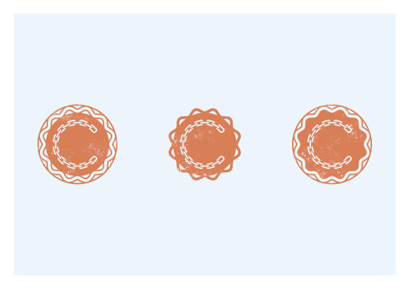
Just for a bit of fun I also doodled some simplified city crests and a wee badge:


I would strongly recommend Roman's 99% Invisible podcast to anyone. From skyscrapers to banknotes, it has design covered!

I'm a Glasgow-based designer of posters, corporate identities and pretty pictures